Why Content Quality Should Determine Publishing Frequency, Not the Other Way Around

Content & Digital Publishing

Why Content Quality Should Determine Publishing Frequency, Not the Other Way Around

Publishing more blog posts is not automatically a sign of a successful content strategy. The real question is whether each piece is useful, well-researched and worth the reader’s time.

Content strategy  ·  6–8 min read

Quality first

Publish when an article is ready to help readers, not because another date on the calendar has arrived.

A common approach to content marketing is to set a publishing target and then organise the team around meeting it. A company might decide that it needs three blog posts every week, for example, and treat that number as a measure of progress.

There is nothing wrong with publishing regularly. A consistent schedule can help a website stay active, cover relevant topics and build an audience over time. The problem begins when the publishing target becomes more important than the quality of the content being produced.

Content should be published when it is ready to provide genuine value, not simply because another date on the editorial calendar has arrived. Publishing frequency should be determined by the level of quality a team can realistically maintain.

The Problem With Prioritising Publishing Frequency

When publishing volume becomes the main target, content production can turn into a numbers exercise. Writers and editors may be expected to complete a fixed number of articles regardless of the research, planning or subject knowledge required for each topic.

This can lead to articles that repeat information already available elsewhere, cover a subject too broadly or offer little practical insight. In some cases, several posts are created around similar keywords simply to keep the publishing schedule full.

The website may appear active, but that does not necessarily mean its content is becoming more useful. Readers are unlikely to return simply because a business publishes frequently. They are more likely to return when its articles consistently answer questions, explain topics clearly or help them make informed decisions.

A publishing schedule is useful only when it supports the creation of content people actually want to read.

Quality Requires More Than Just Writing

A well-written article is not automatically a high-quality article. Good content usually requires several stages of work before it is ready to publish. These stages can include understanding the audience, researching the topic, checking facts, organising information and reviewing the finished piece.

Depending on the subject, the process may also involve original examples, expert input, screenshots, illustrations or links to reliable sources. These elements take time, but they can make the difference between a generic article and one that offers something genuinely useful.

Before publishing, it is worth checking whether an article meets a clear set of standards:

A simple content quality checklist

Tick each item as you review an article.

0 of 6 checked

If a team cannot consistently meet these standards while producing its planned number of articles, the publishing target may need to change. Reducing the number of posts is often better than repeatedly lowering the standard of the work.

More Blog Traffic Does Not Necessarily Mean More Conversions

Publishing more articles can increase the number of pages available to appear in search results. However, additional traffic does not automatically translate into meaningful business results.

An article might attract visitors who are only looking for a quick definition, while another may reach people comparing products or evaluating a service. Both types of content can have a purpose, but their contribution to a business will be different.

This is why content planning should consider the reader’s intent and the role each article plays. Some posts build awareness, some explain a subject in greater depth, and others help readers assess their options. Not every article needs to generate an immediate enquiry or sale, but it should have a reason to exist.

A useful distinction

More visitors measures reach. Relevant visitors taking meaningful actions can tell you more about whether the content is supporting your wider objectives.

Publishing Frequency Should Reflect Actual Production Capacity

Every content team has a limit to how much work it can produce without compromising quality. That limit depends on the number of people involved, their experience, the complexity of the topics and the time available for research, editing and optimisation.

A small team managing several responsibilities may not be able to produce the same volume as a dedicated editorial department. Even within the same organisation, some topics require considerably more preparation than others.

Rather than choosing an arbitrary weekly target, businesses should first understand the work involved in producing a good article. They can then establish a publishing schedule that reflects their actual resources.

This does not mean publishing inconsistently or abandoning planning. It means setting a realistic schedule and allowing enough time for each article to be completed properly. A smaller number of useful, well-maintained articles can be more valuable than a large collection of rushed posts.

Existing Content Deserves Attention Too

Content strategies often focus heavily on creating new articles. However, publishing something new is not always the best use of a team's time. Older articles may contain outdated information, broken links, missing details or sections that no longer match what readers are looking for.

Reviewing and improving existing content can help a website remain accurate and useful. This may involve updating statistics, adding missing explanations, improving internal links, replacing outdated screenshots or restructuring sections that are difficult to read.

Before adding another article to the schedule, it is worth considering whether an existing page could benefit more from an update. Content maintenance should be part of the publishing process rather than something that happens only when rankings decline.

A Content Calendar Should Guide Quality, Not Compromise It

Editorial calendars are useful for organising topics, assigning responsibilities and planning around important dates. They help teams see what is being produced and identify gaps in their content coverage.

However, a calendar should remain a planning tool. It should not force an article to be published before the research, writing or review process is complete. If a topic needs more work, the schedule should allow room for that.

Businesses can also evaluate content using measures that go beyond the number of posts published. Depending on the purpose of each article, useful indicators may include organic visibility, relevant search traffic, engagement, assisted conversions and enquiries.

These measures provide a more meaningful view of content performance than publishing volume alone. They can also help teams identify which topics deserve further investment and which existing pages need attention.

The goal is not to publish as often as possible. It is to publish as often as you can while maintaining a standard that readers can trust.

Conclusion

Publishing regularly can support a successful content strategy, but frequency should never become the main measure of content quality. When businesses prioritise fixed publishing targets above research, usefulness and accuracy, they risk producing articles that add little value to their audience.

A better approach is to define what good content looks like, understand the time and resources needed to produce it, and set a publishing schedule around those requirements. It is equally important to review existing articles and measure performance based on whether the content is achieving its intended purpose.

Publishing frequency should be an outcome of content quality and production capacity, not a constraint imposed on them. A thoughtful article published at the right time is more valuable than another post created simply to meet a quota.

Keep exploring

More practical thoughts on content and digital publishing. Explore more articles on writing, SEO, website development and the ideas behind effective online content on the Interesting to Read blog.

Tagged in

Categories

Written by

Keshera Wijeyesekera

I write Interesting to Read, a blog on all kinds of topics worth your time. Outside of the blog, I work in SEO and digital marketing.
More about me  ·  LinkedIn  ·  Get in touch

Why Blog Design Matters

Blogging · Website Experience

Why Blog Design Matters

A blog is more than a collection of articles. Its design influences how people discover content, read your posts and decide whether your site is worth returning to.

Practical guide  ·  8–10 min read

Design with readers in mind

Good design makes content easier to read, find and trust. It should support the writing, not compete with it.

When someone visits a blog, the design is often the first thing they notice. Before reading a single paragraph, visitors form an impression based on the layout, colours, typography, spacing and overall presentation.

Good blog design does not mean adding complicated effects or making every page look elaborate. It means creating a clear, comfortable experience that helps readers find information and focus on the content. A well-designed blog supports the writing rather than competing with it.

Whether you run a personal blog, a niche website or a business publication, the way your content is presented can influence reader satisfaction, engagement and the long-term growth of your site.

First impressions influence whether visitors stay

Visitors make quick judgements about a website. A cluttered layout, inconsistent colours, outdated elements or difficult-to-read text can make a blog appear neglected. Even useful articles may be overlooked if the presentation does not encourage people to explore.

A clean design gives readers confidence that the website is organised and that its content is worth their time. This does not require an expensive theme. A simple layout, clear headings, consistent spacing and relevant imagery can make a meaningful difference.

Keep in mind

Design should make the value of your content easier to recognise. It should not distract visitors with unnecessary visual effects.

Readability makes articles easier to consume

Blog readers often scan a page before deciding which parts to read closely. Long blocks of text, tiny fonts and weak contrast make this process tiring. Good design breaks information into manageable sections and creates a comfortable reading rhythm.

  • 01 · TypographyChoose readable fontsUse clear typefaces and a comfortable font size. Avoid decorative fonts for long paragraphs.
  • 02 · SpacingGive content roomUse enough line height, paragraph spacing and margins to prevent the page feeling crowded.
  • 03 · StructureUse meaningful headingsOrganise ideas with descriptive H2 and H3 headings so readers can scan the article.
  • 04 · ContrastMake text distinctEnsure text stands out clearly from its background in both desktop and mobile layouts.

Try it yourself

Style a mini blog post. Choose a colour theme, typeface, text size and line spacing, then check the contrast score and notes underneath the preview.

Colours
Typeface
Text size
Line spacing
Blogging tips
Five minutes to a better reading experience

Readers decide quickly whether a page feels easy to read. Colour, typeface, size and spacing all shape that first impression, long before anyone reaches your conclusion.

Notice how this paragraph feels as you change each setting.

Read the guide
11.2 : 1 contrastPasses WCAG AA and AAA for body text.14.7 : 1 contrastPasses WCAG AA and AAA for body text.14.4 : 1 contrastPasses WCAG AA and AAA for body text. Light text on a dark background works when the contrast stays high.2.2 : 1 contrastFails WCAG AA, which asks for at least 4.5 : 1 for body text. Faint text like this is hard to read for many people.
  • Serif type feels traditional and works well for long reading at a comfortable size.
  • Sans-serif type is clean and widely used on screens, which makes it a safe choice for body text.
  • Decorative fonts are hard to read in paragraphs. Save them for a logo or a short heading, if you use them at all.
  • 14px is small for body text on most screens. Many readers will have to squint or zoom.
  • Around 18px is a comfortable body size for most blogs.
  • Large text is easy to read, but very large body text can make an article feel long.
  • Tight line spacing makes lines run together and slows reading.
  • A line height of about 1.6 to 1.8 gives text room to breathe.
  • Very loose spacing can break up the flow, so sentences feel disconnected.

Lists, tables, short examples and relevant images can also make complex topics easier to understand. Use them when they genuinely improve the explanation, not simply to decorate the page.

A blog may contain dozens or hundreds of articles. Without clear navigation, visitors can struggle to find related topics or return to useful sections. A well-organised menu, sensible categories, search function and related-post links make the site easier to explore.

Keep the main navigation focused. Categories should describe meaningful groups of content rather than every small variation of a topic. Within an article, a table of contents can help readers jump directly to the information they need, especially on longer guides.

Mobile-friendly design is essential

Many people browse blogs on phones and tablets. A page that looks attractive on a large monitor can become frustrating on a smaller screen if the text is too small, columns are cramped or menus are difficult to use.

Responsive design adapts the layout to different screen sizes. Text should remain readable without zooming, images should fit their containers, and buttons and links should be easy to tap. Test important pages on an actual phone where possible, not only by resizing a desktop browser.

Blog design supports SEO and usability

Design is not a direct replacement for good SEO fundamentals, but it can support the experience that search engines aim to reward. A logical page structure helps visitors and search engines understand the content. Clear headings, descriptive internal links, accessible navigation and mobile usability all contribute to a better website experience.

Page speed also matters. Large images, unnecessary scripts, excessive animations and poorly configured plugins can slow a site down. Optimise images, remove features that do not add value and choose a layout that works efficiently.

Important distinction

An attractive design alone will not guarantee higher rankings. Useful content, relevance, technical health and a good overall page experience still matter.

Consistency makes a blog feel organised

Using the same visual language across the website helps readers understand how it works. Keep colours, heading styles, buttons, image treatments and spacing reasonably consistent. Article pages should follow a familiar structure so visitors do not have to relearn the layout every time they open a new post.

Consistency does not mean every page must look identical. Landing pages and special features can have their own layouts, provided they still feel like part of the same website.

Good design encourages engagement and action

Depending on the purpose of your blog, you may want visitors to read another article, subscribe to a newsletter, leave a comment, contact you or explore a product. Design can make these next steps easier to notice and understand.

Place relevant calls to action where they make sense. Related articles near the end of a post can help readers continue exploring. A simple newsletter form may work better than several intrusive pop-ups. The goal is to guide visitors without interrupting their reading experience.

Common blog design mistakes to avoid

  • Too many visual elements: banners, animations and pop-ups can compete with the article.
  • Overcomplicated navigation: too many menu items make it harder to find important sections.
  • Inconsistent formatting: changing fonts, colours and spacing from page to page weakens the overall experience.
  • Unoptimised images: large files can slow down page loading.
  • Ignoring mobile users: a layout that only works on desktop excludes a large part of the audience.
  • Designing for appearance alone: visual choices should support the content and the reader's needs.

A practical blog design checklist

Use this quick checklist when reviewing your website. Tick each item as you confirm it.

0 of 8 checked

Frequently Asked Questions

Blog design can support SEO by improving usability, mobile experience, navigation, content structure and page performance. However, design alone does not guarantee better search rankings.

There is no single element that matters in every situation. Readability, clear navigation, responsive layouts and a logical content structure are strong foundations for most blogs.

No. A free or premium theme can work well if it is maintained, responsive, accessible and flexible enough for your needs. The quality of the implementation matters more than the price of the theme.

Review your design periodically and whenever your website's needs change. You do not need a complete redesign every year. Fix usability problems and improve elements that no longer serve readers.

Yes. A simple design can be highly effective when it makes content easy to read, helps visitors navigate the site and works reliably across devices.

Conclusion

Blog design matters because it shapes the way people experience your content. A clear, readable and responsive layout helps visitors find information, stay focused and explore more of your website. It also supports important website goals such as engagement, accessibility and SEO.

You do not need an elaborate design to create a successful blog. Start with the essentials: readable typography, sensible navigation, consistent formatting, fast-loading pages and a layout that works on mobile devices. When design decisions are made with readers in mind, the entire blog becomes more useful.

Keep improving your blog

Once your design is working for readers, see how they actually use it with Google Analytics: A Practical Guide to Understanding Your Website.

Tagged in

Categories

Written by

Keshera Wijeyesekera

I write Interesting to Read, a blog on all kinds of topics worth your time. Outside of the blog, I work in SEO and digital marketing.

More about me  ·  LinkedIn  ·  Get in touch

Blog Conversion Rate: What It Means and How to Improve It

Blogging and Content Strategy

Blog Conversion Rate: What It Means and How to Improve It

Learn how to measure the actions readers take after visiting your blog, understand what affects conversions and make practical improvements without compromising the reader experience.

Practical guide  ·  Includes a conversion calculator  ·  Measurement and optimisation tips

Keep the goal clear

A conversion is the action that matters to your blog or business. Decide what you want readers to do before trying to improve the rate.

A blog can attract thousands of visitors and still generate very few enquiries, subscriptions or sales. Traffic is useful, but it does not always show whether readers are taking the next step you want them to take. This is where the blog conversion rate becomes useful. It helps you understand how effectively your content encourages visitors to complete a specific action.

That action will depend on the purpose of your website. A personal blog might aim to gain email subscribers, while a business blog may be designed to generate enquiries, product sales or course registrations. The important point is to measure actions that support the purpose of the page.

What Is a Blog Conversion Rate?

A blog conversion rate is the percentage of visitors or sessions that complete a desired action after viewing or interacting with a blog page. The action is known as a conversion.

For example, if 1,000 people visit a blog post and 30 of them subscribe to an email newsletter, the conversion rate is 3% when calculated using visitors as the denominator.

In simple terms

Your blog conversion rate tells you how often readers take the action you are measuring. It is not necessarily a measure of how many people buy something.

Before measuring the rate, define what counts as a conversion. A newsletter subscription, contact form submission and completed purchase are different outcomes, so they should normally be tracked separately.

How Do You Calculate Blog Conversion Rate?

The basic calculation is straightforward. Divide the number of conversions by the number of visitors or sessions, then multiply the result by 100 to express it as a percentage.

Formula

Conversion rate = (Conversions ÷ Visitors) × 100

Use a consistent denominator when comparing results over time.

Example calculation

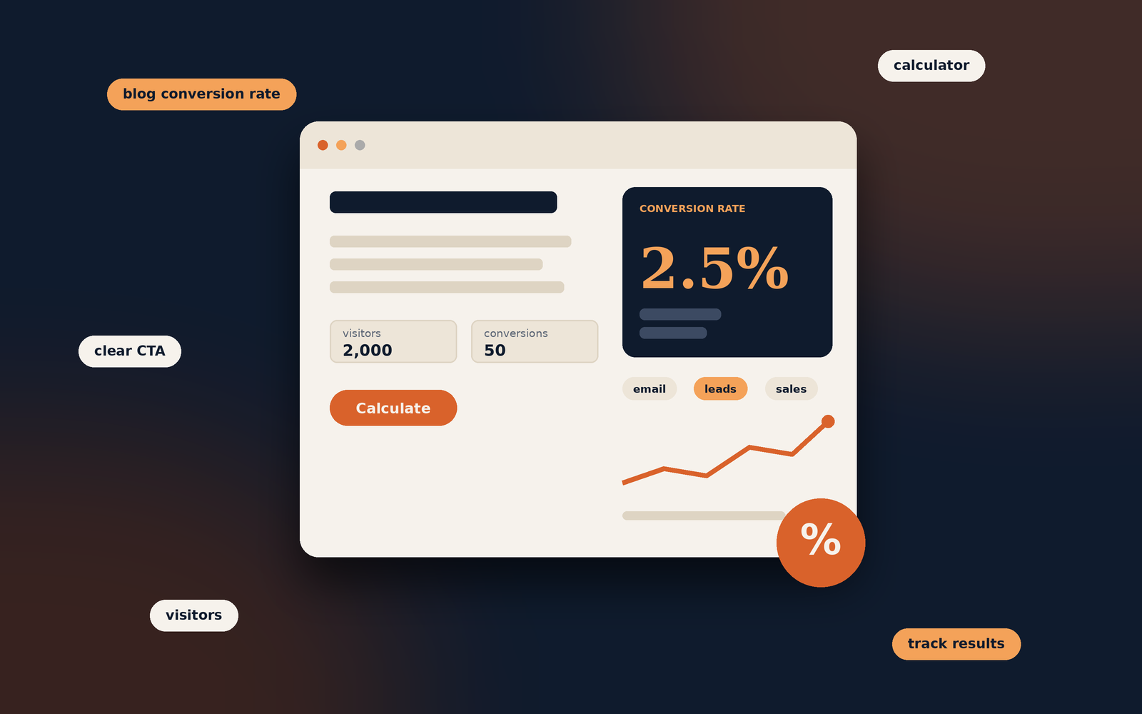
A blog article receives 2,000 visitors during a month. Of those visitors, 50 complete a newsletter subscription.

(50 ÷ 2,000) × 100 = 2.5%

The article's visitor-based newsletter conversion rate is 2.5% for that period.

Try the blog conversion calculator

Enter your own figures to calculate a simple conversion rate.

Calculated conversion rate2.50%50 conversions from 2,000 visitors or sessions.

This calculator uses the figures you enter. It does not connect to your analytics account.

Some reports calculate conversion rate using sessions, while others use users or visitors. These methods can produce different results. Choose the measurement that fits your reporting setup and use it consistently. Do not compare rates calculated from different denominators as if they were identical.

What Counts as a Blog Conversion?

A conversion is not limited to a purchase. It can be any meaningful action that supports the goal of the article, website or business.

  • Email subscriptionsA reader signs up to receive newsletters, updates or new articles.
  • Enquiry submissionsA potential customer completes a contact form or requests a consultation.
  • DownloadsA visitor downloads a guide, checklist, template or other resource.
  • PurchasesA reader buys a product or service after visiting relevant content.
  • Course registrationsA prospective learner registers for a course or requests course information.
  • Affiliate actionsA visitor clicks a tracked affiliate link or completes a qualifying purchase.

Not every action has the same value. An email subscription may be an early step in a customer journey, while a completed purchase is a direct sale. Decide which outcomes matter and report them separately rather than combining unrelated actions into one figure.

Why Is Blog Conversion Rate Important?

Conversion rate adds context to traffic data. It helps you understand whether a blog post is doing more than attracting visits and whether the page is guiding readers towards a useful next step.

  • Evaluate content performance: Identify articles that generate subscriptions, enquiries or sales, not just page views.
  • Find improvement opportunities: A popular post with few conversions may need a clearer next step or a better match between its content and offer.
  • Understand reader behaviour: Compare the actions taken by visitors who arrive on different articles or from different channels.
  • Support business objectives: Connect content activity with outcomes such as qualified leads, registrations and revenue.
  • Prioritise your work: Focus testing and updates on pages where an improvement could make a meaningful difference.

A low conversion rate does not automatically mean that an article is poor. Some posts are designed to answer a question fully, build awareness or introduce a topic. Their value may not appear as an immediate form submission or purchase.

How to Improve Your Blog Conversion Rate

Improving conversions is not simply a matter of adding more buttons. The page needs to attract the right readers, meet their expectations and make the next step relevant and easy to complete.

1. Match the content to the reader's intent

Understand why someone is visiting the article. A person looking for a basic definition may not be ready to request a sales consultation. A visitor comparing services, however, may appreciate a clear route to an enquiry page.

Make sure the offer or call to action fits the stage of the reader's journey. A relevant resource or related article can be more appropriate than an immediate sales message.

2. Use clear calls to action

A call to action (CTA) tells readers what they can do next. Use direct wording that explains the benefit or outcome, such as “Download the checklist” or “View the course details”. Avoid vague labels that do not explain what happens after the click.

Place CTAs where they make sense in the article. A relevant prompt near the end may work well, while a short contextual link can help readers who are ready to take the next step earlier.

3. Make the offer relevant to the article

Connect the next step to the subject the reader is exploring. A post about planning a blog might offer a content calendar template. An article explaining a service could link to a related service page or enquiry form.

4. Improve readability and page structure

Use descriptive headings, focused paragraphs and clear explanations. Readers should be able to understand the article and find the relevant CTA without struggling through a dense page. Good formatting supports the experience, but it should not interrupt the content.

5. Make the page work well on mobile

Check that text is comfortable to read, forms are easy to complete and buttons are large enough to tap. Test the complete journey on a phone, including any confirmation page or follow-up step.

6. Reduce unnecessary friction

Only ask for information you genuinely need. A long form can discourage people who are interested but not ready to provide extensive details. Make form labels clear, explain required fields and show a helpful confirmation after submission.

7. Build trust before asking for action

Give readers enough information to make an informed decision. Explain what they will receive, make pricing or service details clear where relevant, and use accurate testimonials or evidence only when you can verify them. Avoid exaggerated claims and misleading urgency.

8. Test changes rather than guessing

Try one meaningful change at a time, such as revising a CTA label, moving a form or improving the explanation of an offer. Compare results over a suitable period and account for changes in traffic sources, seasonality and audience mix.

Keep the reader experience first

A conversion improvement is worthwhile when it helps the right reader take a relevant action. Avoid intrusive pop-ups, misleading buttons or pressure tactics that may damage trust.

How to Measure Blog Conversions

Use an analytics setup that records the actions you have defined as conversions. Google Analytics 4 can report events and key events, while form tools, ecommerce platforms and email services may provide additional records that help validate the results.

Set up meaningful events

Identify the action you want to measure, such as a successful form submission, newsletter sign-up or purchase. Configure the relevant event and mark it as a key event in GA4 when it represents an important business outcome. Make sure the event fires when the action is completed, not merely when someone clicks a button.

Review performance by article

Look at which landing pages contribute to the conversions you care about. Compare articles with similar purposes and audiences. A high-traffic informational article may behave differently from a product comparison post, so avoid treating every page as if it has the same job.

Use a consistent reporting period

Compare equivalent periods and check whether traffic volume or source mix has changed. A rate based on a small number of visitors can fluctuate considerably, so consider the number of conversions as well as the percentage.

For setup instructions, consult Google's GA4 event documentation and its guidance on key events. The exact reports available can depend on your property's configuration.

Common Blog Conversion Rate Mistakes

  • Counting every click as a conversion: A button click does not always mean the intended action was completed. Track successful outcomes where possible.
  • Using inconsistent calculations: Do not switch between users, visitors and sessions when comparing rates without explaining the difference.
  • Focusing only on the percentage: Review the number and quality of conversions, not just the rate.
  • Expecting every article to sell: Some content supports awareness, education or research rather than an immediate transaction.
  • Adding irrelevant CTAs: A generic offer may not fit the reader's reason for visiting the page.
  • Making several changes at once: If you change the headline, layout, CTA and form together, it becomes harder to understand what influenced the result.
  • Ignoring tracking errors: Test events and forms to confirm that conversions are recorded accurately.

Frequently Asked Questions

There is no universal conversion rate that is considered good for every blog. Results depend on the action being measured, the audience, the topic, traffic source, offer and website experience. Compare similar pages and track changes against your own baseline.

No. Conversion rate measures the proportion of visitors or sessions that complete a defined action. Bounce rate in GA4 is based on the proportion of sessions that are not engaged. They describe different aspects of website behaviour.

Yes. A page can convert a relatively high proportion of a small audience. However, the total number of conversions may still be low. Consider both traffic volume and conversion rate when assessing performance.

A relevant next step can be helpful, but it does not need to be a sales CTA. Depending on the article, you might suggest a related guide, invite readers to subscribe or simply allow them to finish reading without interruption.

Configure events for meaningful completed actions, test that they are recorded correctly and mark important events as key events in GA4. You can then review the relevant reports and landing pages. Follow Google's current documentation for your specific setup.

SEO can influence which people discover your content and how well the page matches their search intent. Relevant organic traffic may be more likely to take a suitable next step, but rankings alone do not guarantee conversions. The offer and page experience also matter.

Wrapping up

Make each visit count. Blog conversion rate helps you understand whether readers are taking actions that support the purpose of your content. Define meaningful conversions, measure them consistently and improve the page in ways that make the next step clearer and more useful.

Keep improving your blog content

Explore Blog Readability: How to Make Content Easier to Read for practical ways to make your articles clearer and easier to follow.

Tagged in

Categories

Written by

Keshera Wijeyesekera

I write Interesting to Read, a blog on all kinds of topics worth your time. Outside of the blog, I work in SEO and digital marketing.

More about me  ·  LinkedIn  ·  Get in touch

How to Turn Every Blog Post into a High-Converting Landing Page

SEO, Content and Conversion

How to Turn Every Blog Post into a High-Converting Landing Page

A practical guide to making blog content more useful, easier to navigate and better at helping readers take the next step, without turning every article into an aggressive sales page.

Practical guide  ·  Design and SEO  ·  Publishing checklist

Keep the reader's goal first

A conversion-focused article should help readers make a useful next move, not pressure them into an unrelated action.

A blog post can attract search traffic, answer a question and introduce readers to your website. But publishing an article is only part of the job. If the page is difficult to navigate, gives readers no clear next step or makes its main offer hard to find, much of its potential can be lost.

One way to improve the value of existing content is to treat each article as a focused landing page. That does not mean removing the editorial feel or filling the page with sales messages. It means aligning the article's purpose, layout and calls to action with what the reader came to do.

What Is a Blog Landing Page?

A blog landing page is an article designed to meet a specific reader need while guiding visitors towards a relevant next step. That step might be reading a related guide, downloading a resource, subscribing to a newsletter, trying a tool or enquiring about a service.

Traditional landing pages often focus on one campaign or offer. A blog article usually provides more explanation and context. The approaches can work together: the article answers the reader's question, while a relevant action helps the reader continue.

Example

Article: How to Improve Website Loading Speed

Relevant next step: A downloadable site-speed checklist, a related performance guide or a clearly labelled website audit enquiry.

The next step fits the topic, so it feels like a continuation of the article rather than an interruption.

Choose One Clear Goal for Each Article

Before changing the layout or adding a call to action, decide what the article should help readers do. A page can contain several useful links, but it should have a clear primary purpose.

  • Educate: Help readers understand a topic or complete a task.
  • Build an audience: Encourage relevant visitors to subscribe to updates.
  • Generate enquiries: Introduce a relevant service after explaining the problem it solves.
  • Support a purchase decision: Help readers compare options with balanced information.
  • Guide readers to related content: Lead them to the next article or resource in a topic cluster.

Match the action to the article's subject and the reader's likely stage of decision-making. Someone reading a beginner's guide may not be ready to request a quote, but might appreciate a checklist or a more detailed tutorial.

Research the Reader's Intent Before You Redesign

A landing-page approach only works when the page satisfies the reason someone arrived. Review the questions your audience asks, the language they use and what the current article already does well.

  • Review queries and page performance in Google Search Console.
  • Explore topic interest with Google Trends.
  • Read relevant customer questions, support requests and comments, where available.
  • Compare competing results to identify useful questions or formats the article does not cover.
  • Check whether the title, introduction and content match the promise that brought visitors to the page.

Use research to improve the page, not to copy competitors or add irrelevant sections. Google's guidance on helpful, reliable, people-first content is a useful reference when reviewing whether an article provides genuine value.

Structure the Article Around the Reader's Journey

Readers should be able to understand the page's purpose, find the information they need and recognise the next step without having to work it out themselves.

  • Start with a direct introductionExplain the question or problem and set expectations for the article.
  • Use descriptive headingsBreak the topic into logical sections readers can scan and revisit.
  • Answer the main question earlyGive readers useful information before asking them to take action.
  • Place the next step naturallyIntroduce a relevant resource when the surrounding content makes it useful.

The Google SEO Starter Guide is a useful reference for making pages easier for search engines and people to understand. Clear organisation also supports readers using assistive technologies when headings follow a meaningful hierarchy.

Build Trust Before Asking for a Conversion

A conversion-focused page still needs to earn the reader's confidence. Explain important claims, keep promises realistic and make it easy to understand who is behind the content or offer.

  • Check factual claims, statistics, dates and technical advice.
  • Link to official documentation, original research or reputable sources when relevant.
  • Use examples, screenshots or original observations where they genuinely help.
  • Explain limitations, requirements, pricing or conditions that could affect a decision.
  • Keep author details and business information accurate.
  • Avoid fabricated testimonials, misleading urgency and exaggerated outcomes.

External links should help readers verify a claim or explore the subject further. They should not be added simply to make a page appear authoritative.

Make the Design Easy to Read and Navigate

Visual design should make the article easier to use. A page can look polished and still perform poorly if the text is cramped, contrast is weak or controls are difficult to find.

Focus on readability

  • Use comfortable body text size and line spacing.
  • Keep the reading column at a manageable width on larger screens.
  • Use headings, lists, tables and callout panels when they clarify information.
  • Keep paragraphs focused, while allowing explanations to be as long as needed.
  • Use images, diagrams and screenshots when they add information.

Design for accessibility

Check text contrast, keyboard navigation, focus states, image alternative text and form labels. Avoid relying on colour alone to communicate important information. The W3C Web Accessibility Initiative and its Web Content Accessibility Guidelines provide recognised guidance.

Keep the design consistent with the rest of your website. A blog should still feel like part of the site, not like an unrelated advert that happens to use the same logo.

Use Clear, Relevant Calls to Action

A call to action (CTA) tells readers what they can do next. The wording should describe the action and its value without promising more than the destination delivers.

CTA examples

Vague: Click here

Clearer: Download the website launch checklist

Vague: Learn more

Clearer: Compare the website hosting options

Place a CTA where it makes sense in the reader's journey. A relevant link near the introduction can help someone who already knows what they need, while a CTA after a detailed explanation may suit someone who needs more context first.

One primary CTA is often easier to understand than several competing buttons. Supporting links can still be useful, provided they do not distract from the page's main purpose. Test wording and placement rather than assuming one design works for every article.

Add Interactive Features Only When They Help

Interactive elements can make an article more useful, but they should solve a problem rather than exist as decoration.

  • Downloadable checklists: Give readers a practical summary they can use away from the page.
  • Calculators: Help readers estimate a result when inputs and assumptions are clear.
  • Quizzes or assessments: Help visitors identify a suitable next step when the result is meaningful.
  • Expandable FAQs: Keep supporting answers available without making the page unnecessarily long.
  • Progress indicators: Show reading progress on longer guides, provided the indicator is not distracting.
  • Shareable quotes or diagrams: Make a useful idea easier to save or share while preserving context and attribution.

Do not add a calculator, quiz or form just because it might increase engagement. Each feature should make the article more helpful or make the next step easier.

Keep the Page Fast and Mobile-Friendly

A slow or awkward page can interrupt readers before they reach the content or CTA. Review performance on mobile as well as desktop, especially if many visitors use phones.

  • Resize and compress images appropriately.
  • Avoid unnecessary scripts, animations and third-party widgets.
  • Use responsive layouts and make buttons and links easy to tap.
  • Prevent layout shifts by specifying image dimensions and reserving space for content that loads later.
  • Check that forms and embedded tools work on smaller screens.

Use PageSpeed Insights to review performance and field data where available. Google's Web Vitals guidance explains user-experience metrics, while the Chrome User Experience Report provides information about real-world user experience data.

Performance is an ongoing process, not a one-time score. Fix issues that materially affect the experience and test again after significant changes.

Track Conversions and Improve the Page

You cannot reliably improve a landing page if you do not know what visitors do on it. Decide what counts as a meaningful conversion before configuring analytics.

Depending on the article's purpose, useful events might include:

  • Submitting a contact or enquiry form.
  • Signing up for a newsletter.
  • Downloading a resource.
  • Clicking through to a product or service page.
  • Completing a relevant tool or assessment.

In Google Analytics 4, configure relevant events and mark the actions that matter to your business as key events. Check that tracking works correctly and respects privacy and consent requirements.

Review the results in context

Look at more than clicks alone. A CTA may receive many clicks but lead to few completed sign-ups. Review the full journey, including form completion, lead quality and whether visitors find the information they expected.

Test one meaningful change at a time where practical, such as CTA wording, placement or offer clarity. Google Optimize was discontinued in 2023, so avoid old tutorials that depend on it; choose a currently supported testing method appropriate to your setup and traffic.

Internal links help readers move between relevant pages and help search engines discover relationships between them. Link to related guides, definitions, comparisons or service pages when they genuinely add value.

External links can provide evidence, official instructions or further reading. Use descriptive anchor text so readers have a reasonable idea of what they will find before clicking.

  • Link to the next logical resource, not every page on the site.
  • Check that important links work and lead to the intended destination.
  • Avoid vague anchor text when a more descriptive phrase fits naturally.
  • Review older links when refreshing an article.
  • Do not add links purely to manipulate rankings or distract readers.

For ecommerce content, product cards or comparison tables can be useful when they answer a genuine decision-making need. Clearly disclose affiliate relationships where applicable and make sure product claims are accurate.

Refresh Useful Content and Promote It Responsibly

Older articles can become more useful when information, screenshots, examples, links and calls to action are reviewed. Start with pages that attract relevant traffic, support an important topic or contain information that may have changed.

  • Check whether the article still answers the reader's question.
  • Update outdated facts, links, screenshots and examples.
  • Remove repetition and improve unclear sections.
  • Make the CTA relevant to the current article and offer.
  • Check mobile layout, accessibility and analytics events.

Promote updated content through channels that suit your audience, such as a relevant newsletter, social post or internal link from another article. Avoid sending unrelated traffic simply to inflate page views. The aim is to reach people who can genuinely benefit from the content.

Blog Landing Page Checklist

Use this review before publishing or updating an article. Tick each item as you complete it.

Frequently Asked Questions

Not exactly. A blog post usually focuses on explaining a topic, while a landing page often focuses on a specific campaign or action. A blog post can still guide readers towards a relevant next step without losing its editorial purpose.

A relevant next step can be useful, but it does not need to be a sales CTA. It might be a related article, checklist or newsletter sign-up. Choose an action that fits the topic and the reader's needs.

Place it where it naturally supports the reader's journey. Some readers may benefit from an early link, while others need the explanation first. Test placements using meaningful outcomes rather than clicks alone.

No. A calculator, quiz or downloadable resource can help when it solves a real problem, but unnecessary features can add friction, slow the page or distract readers.

Track the action that matches the page's goal, such as a completed form, sign-up or resource download. Also review the journey, lead quality and whether the page satisfies the visitor's intent.

Often, yes. Start with focused improvements to the article's structure, CTA clarity, internal links, mobile usability and tracking. A larger redesign may be useful later, but it is not always the first step.

No. There is no layout that guarantees search rankings or conversions. Focus on helpful content, accessibility, performance and a clear user journey, then measure how the page performs for its intended audience.

Wrapping up

Make the next step useful. A strong blog landing page begins with a clear answer to the reader's question. Improve the structure, make the page comfortable to use, provide a relevant next step and measure whether it helps visitors achieve their goal. The purpose is not to turn every article into a sales pitch; it is to make every useful article work harder for its readers.

Keep improving your content

Explore more practical guides on the Interesting to Read blog to improve your writing, SEO and website content.

Tagged in

Categories

Written by

Keshera Wijeyesekera

I write Interesting to Read, a blog on all kinds of topics worth your time. Outside of the blog, I work in SEO and digital marketing.

More about me  ·  LinkedIn  ·  Get in touch

Share with